R for Spatial Analysis Courses in Liverpool and London

This week I have run two courses on ‘Introduction to Using R for Spatial Analysis’ which have been very successful. Both courses sold out, with 15 people attending in Liverpool and 20 in London. We had people with a wide range of GIS and R experience, ranging from no experience in either GIS or R, to significant experience in one but little in the other.
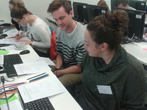
2015-12-02 11.34.09We covered the basics of using R through the RStudio interface, which I find makes R easier to understand for newbies! I certainly found it much easier to learn R using RStudio, and still use it everyday for my R work (I’ve opened the native R interface maybe twice since I started using it!). We also looked projections and coordinate systems (which were at the bottom of a GIS problem a colleague had today) and at spatial data representation, particularly how to create a representative, truthful choropleth map, and I made use of a blog post about this very issue, which I recently tweeted.
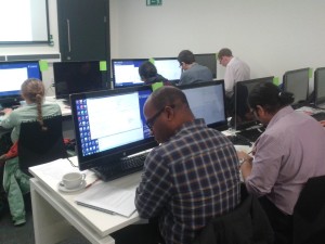
2015-12-02 11.34.21We also had a number of very interesting discussions about the pros and cons of R vs other GIS software, such as ArcGIS or QGIS, as well as other languages, such as Python. Each has their own pros and cons, and in my work I regularly use a mix of these, depending on what I am trying to achieve.

 I am also in the process of developing an intermediate course that will focus more on spatial analysis. If you are interested in finding out more about when either the basic or the intermediate courses will be run again, please send me a message (using the contact form on this site) and I will add you to a list to hear about future courses.

All of the material from this course is freely available, and hosted on GitHub. Head over to http://github.com/nickbearman/intro-r-spatial-analysis and you can view the material yourself and work through it at your own pace. You can even use it to contribute to new teaching material, and if you do, please also make your material available through Creative Commons so others can benefit from it as well.

Cross-posted at http://geographicdatascience.com/blog/training/R-for-Spatial-Analysis-Courses-in-Liverpool-and-London/.

Using Google Docs to write a collaborative article

Update (25/02/2016): Article now publised at dx.doi.org/10.1080/03098265.2016.1144729

Google-docs-logoOriginal (30/11/2015): Just recently I have had an article accepted (but not yet published) that I wrote using Google Docs. It was a collaborative article from a writing retreat with 5 people contributing. We needed some way of all being able to contribute to the article and I had heard of people using Google Docs for this before, so I suggested we give it a go. We actually started using Google Docs to write notes and outlines during the writing retreat and then developed this into the final article.
Using Google Docs has a number of advantages over sending email attachments back and forth and bookmarking the page allowed me to have easy access to the article whenever I wanted it. It didn’t solve all of the problems of writing a joint article by any means, as we still needed a lead author to coordinate people, set deadlines and remind people to contribute by the deadlines!

One thing I observed was that is wasn’t very easy to tell different contributors apart – all of the text by default was the same colour, so we ended up changing the text colour manually for our contributions. Later on I discovered the “suggestions” option which did highlights changes in different colours. I didn’t find a way to put this on by default, but had to ask everyone to make sure they had that set before starting their contributions. Fortunately everyone did remember though! We also used the discussion option quite a bit to talk about specific changes. However you still needed someone to “accept” or “reject” the suggestions, which I took on as lead author.

Automatically, I received a notification every time a change was made, which was useful in some ways so I could see when people had been making changes, but I’m not sure I found it that useful. Being not completely trusting of Google, I did take regular backups (through export as Word doc) in case our text just disappeared on us, but we didn’t suffer any of these issues.

Overall, Google Docs was very useful for collaboration, allowing people to write whenever was convenient for them, without having to worry about different file versions. However we still needed someone to lead the paper (me in this case!) to encourage, remind and cajole co-authors to contribute and meet deadlines, like any other writing collaboration.

Discussion in THE GEES network leads to publication in Environment and Planning A!

Cross-posted from https://www.linkedin.com/grp/post/6509105-6011573350550302720

About 6 months ago Sarah Dyer suggested an e-reading group on a recently published paper – Peters K, Turner J, 2014, “Fixed-term and temporary: teaching fellows, tactics, and the negotiation of contingent labour in the UK higher education system” Environment and Planning A 46(10) 2317 – 2331 (http://www.envplan.com/abstract.cgi?id=a46294). The original post is at https://www.linkedin.com/grp/post/6509105-5943727838417948672. THE GEES is a closed group on LinkedIn, but if you would like to join, please just submit a join request. 

Sarah, Helen Walkington, Stephanie Wyse and I met up on Skype to discuss our thoughts on the paper and wrote our discussion up as a Letter to the Editor for Environment and Planning A, which has now been published (http://www.envplan.com/abstract.cgi?id=a4704l)! (The preprint is available on my publications page if you can’t access EPA). 

I really enjoyed the process and it didn’t take too much of our time. If there’s an article you think it would be interesting to discuss, post it up here and see who else is interested.

Thanks very much to Sarah for starting this off for us, and coordinated THE GEES group!

Catrograms

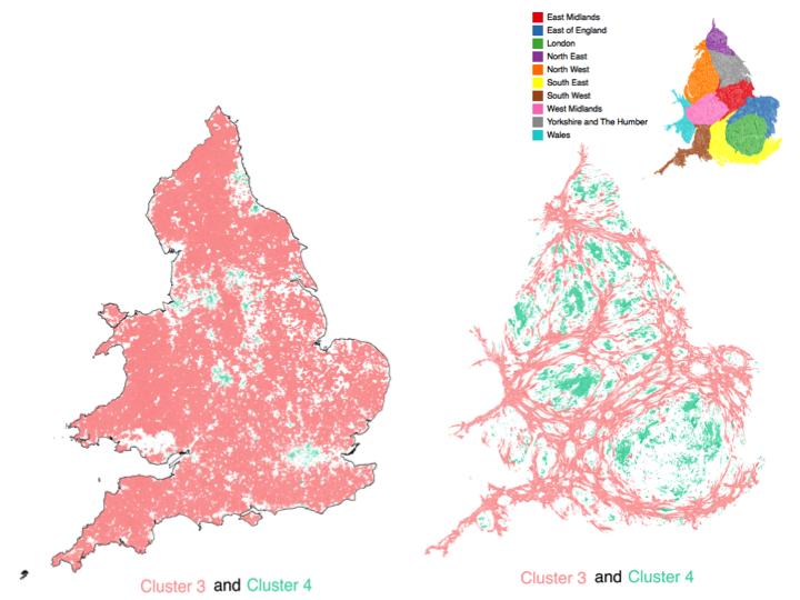
Cartograms are a great way of representing data that refers to people, and it allows you to give urban areas (which generally cover relative small areas) much more prominence than rural areas (which usually cover very large areas). The image below shows the usual geographic representation of the output areas, alongside the cartogram version. Note how the rural cluster (representing about 13% of the population) is very dominant in the ‘standard’ representation, but much less so in the cartogram representation.

Cartogram example

For my presentation at GISRUK2015 on TravelOAC (travel geodemographics) I was presenting a series of cluster data by 2011 Census output areas. Output areas are based around a standard population, with the result that many rural output areas are geographically large and many urban output areas are geographically small. When considering the classification data, it makes sense to give each output area equal consideration, so I decided to create a cartogram of the output area boundaries, based on the usual resident population.

I used a piece of software called ScapeToad which is a quick and easy way to create a cartogram from a custom data set. They have a good set of instructions on their website and the processing of all OAs in England and Wales (181,408 areas, 79mb shapefile) only took 49 seconds.

I was inspired by the cartograms used on the ONS Census Interactive website showing a range of variables. There are a number of ways of generating cartograms, and the ONS team used an approach based on http://lambert.nico.free.fr/tp/biblio/Dougeniketal1985.pdf where the browser does a lot of the heavy lifting. There is also an ArcScript available for ArcGIS at http://arcscripts.esri.com/details.asp?dbid=15638 which I used a few years ago and worked well then, but I’m not sure if it still does now!

P.S. Unfortunately I didn’t manage to see Chris’s presentation on cartogram methods (http://leeds.gisruk.org/abstracts/GISRUK2015_submission_83.pdf) as it was on at the same time as I was presenting!

GISRUK2015 and TravelOAC

I presented my work on TravelOAC at GISRUK this year, based at Leeds. The conference was great and it was a great opportunity to meet an incredible range of people involved in GIS, from engineers, historians, social scientists, spatial information scientists (as they like to be called!), mathematicians and, of course, geographers. We had a great crowd on Twitter as well (#GISRUK2015) who kept everyone up to date on proceedings, and I’d particularly like to mention @adjturner who has made his conference notes available online at . I was also involved in the GIS for Transport Applications workshop, which Robin has written up. Next year, we are at Greenwich, so see you there!

My slides and paper are available, and I have also written a post about how I created the cartograms I used in my work.

Introduction to Using R for Spatial Analysis

On Friday 23rd January 2015, I ran a one day workshop on an Introduction to Using R for Spatial Analysis. We had 18 participants (thanks for squeezing in, everyone!) from a wide variety of backgrounds in R, from never having used R to using R relatively regularly, but not used it as a GIS. The course ran really well, and I was very happy with it, given that it was the first time I had run this course in this format. If you are interested in attending this course in the future, please send me a message (using the contact form on this site) and I will add you to a list to hear about future courses.

I’ve attached the materials I used to this blog post (see below). My material available under the Creative Commons Attribution-ShareAlike 4.0 International License (seehttp://creativecommons.org/licenses/by-sa/4.0/deed.en for details), which means that the material I created for this training session is free for anyone to use, as long as you attribute the material to me, and make any material you derive from this available under the same license. I would also ask you to let me know when you use my material, as it’s useful for me to know how many people are using it, and what sort of courses they are using it for.

Introduction to QGIS: Understanding and Presenting Spatial Data

On Thursday 22nd January 2015, I ran a one day workshop on an Introduction to QGIS: Understanding and Presenting Spatial Data. We had 14 participants from a wide variety of backgrounds, academic areas and geographic locations. The course ran very well, and the participants seemed to enjoy taking the course as much as I enjoyed delivering it! If you are interested in attending this course in the future, please send me a message (using the contact form on this site) and I will add you to a list to hear about future courses.

I’ve attached the materials I used to this blog post (see below). My material available under the Creative Commons Attribution-ShareAlike 4.0 International License (see http://creativecommons.org/licenses/by-sa/4.0/deed.en for details), which means that the material I created for this training session is free for anyone to use, as long as you attribute the material to me, and make any material you derive from this available under the same license. I would also ask you to let me know when you use my material, as it’s useful for me to know how many people are using it, and what sort of courses they are using it for.

Modelling individual level routes and CO2 emissions for home to school

We have recently published a paper in the Journal of Transport and Health where we modelled the impact on CO2 emissions of an increased uptake of active travel for the home to school commute. The paper is freely available to anyone under Gold Open Access, with a CC-BY Attribution license.

One of the challenges in this paper, building upon (Singleton, 2014) was being able to model individual routes from home to school for all ~7.5 million school children in England. In addition to origin and destination locations, we also know what modes of travel are typically used to get to school, thanks to the School Census (also known as the National Pupil Database). While modelling a small number of routes is relatively straight forward to perform within a GIS, the challenge was to complete the routing for all 7.5 million records in the data set.

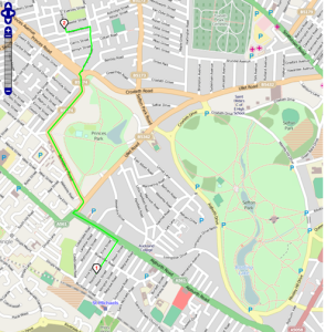
To calculate the route, we used a combination of two different pieces of software – Routino and pgRouting. Routino allows us to use OpenStreetMap data to derive a road-based route from given start and end points, using a number of different profiles for either car, walking, cycling or bus. The profile used is important, as it allows the software to take into account one-way streets (i.e. not applicable to walking, but applicable to driving), footpaths (i.e. applicable to walking only), cycle lanes, bus lanes, etc.. The screenshot below shows an example route, calculated by Routino.

Screenshot of routing within Routino

Example of the route calculated using Routino for a car travelling from Rosslyn Street (1) to Granby Street (2). © OpenStreetMap contributors, http://www.openstreetmap.org/copyright.

For railway, tram or tube travel, this was implemented using pgRouting from both Ordnance Survey and edited OSM data. The different networks were read into the PostgreSQL database, and routes calculated using the Shortest Path Dijkstra algorithm. This returned a distance for the route, which was stored alongside the original data.

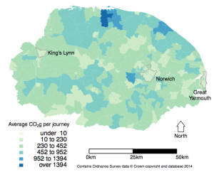
Routino and pgRouting were called using R, which also managed the large amounts of data, subsequently calculated the CO2 emissions model, and created graphical outputs (see below).

Map of CO2 emissions (grouped by residence LSOA) for Norfolk.

Map of CO2 emissions (grouped by residence LSOA) for Norfolk.

To run the routing for each pupil for four years worth of data (we had data from 2007/8-2010/11, although we only used data from academic year 2010-2011 in the paper) took about 14 days on my 27″ iMac. We considered using a cloud solution to shorten the run times, but given we were using sensitive data this was deemed too problematic (see related blog post from Alex on this). This work highlights that it is possible to perform some types of big data analysis using a standard desktop computer, which allows us to perform this type of analysis on sensitive data without needing to make use of cloud or remote processing services, which are often not compatible with restrictions on sensitive data.

*As you would expect, the postcode unit is sensitive data and we had to apply to the Department of Education to use this data. Any postcodes or locations used in this blog post will be examples – e.g. L69 7ZQ is the postcode for my office!

Singleton, A. 2014. “A GIS Approach to Modelling CO2 Emissions Associated with the Pupil-School Commute.” International Journal of Geographical Information Science 28 (2): 256–73. doi:10.1080/13658816.2013.832765.

Cross-posted from http://geographicdatascience.com/r/2014/11/20/Home-School-Routes/

Introduction to QGIS: Understanding and Presenting Spatial Data

On Monday 17th November, I ran a day course on Spatial Data and QGIS with 15 participants. We had people from a wide range of backgrounds and interests, including geology, politics, health and many other disciplines. We looked at some of the theory behind GIS, such as projections and coordinate systems, as well as practical elements on how to use QGIS. I managed to get QGIS version 2.6 (Brighton) installed on the University systems, which only came out towards the end of October, so it was great that the participants could see and use the latest version. We also looked at the process of classifying data for cholopleth maps, including the important decisions to make when selecting colours, number of classes and method of classification.

I’ve attached the materials I used to this blog post (see below). I took the decision to make my material available under the Creative Commons Attribution-ShareAlike 4.0 International License (see http://creativecommons.org/licenses/by-sa/4.0/deed.en for details), which means that the material I created for this training session is free for anyone to use, as long as you attribute the material to me, and make any material you derive from this available under the same license. I would also ask you to let me know when you use my material, as it’s useful for me to know how many people are using it, and what sort of courses they are using it for.

In this form, some of the resources will be more useful than others, but I hope they are helpful. Any comments are gratefully received, either via email, or through  comments below.

Happy GISing!

Resources:


‘Hearing In’: Philosophical perspectives on sonification

I was invited to attend ‘Hearing In’ on Friday 10th October, a workshop organised by the Centre for the Study of the Senses, Institute of Philosophy, University of London. I was speaking about my work on sonification, alongside Chris Chafe (Stanford, US) and Paul Vickers (Northumbria, UK) and the aim of the workshop was to examine some of the theoretical challenges raised by sonification, and to explore the relevance of specific examples for our philosophical understanding of auditory and music perception. (Download programme, PDF, 53KB).

Chris Chafe showed us a wide variety of examples from his work as a musician, composing sonifications in collaboration with scientists and engineers. One of the areas he is interested in is whether a computer can be programmed to create human sounding music, with the hope this can aid our understanding of the creation of music. He also showed a range of installations, including a sonification of the ripening process of tomatoes and the tides.

My presentation was of my PhD work on sonification, evaluating ways of using sound to represent spatial data. I am very interested in how we combine sound with vision to represent additional spatial data, rather than using sound as a replacement for visual display of spatial data. The presentation is available below, and includes my PhD work with specific reference to my second case study on the UKCP09 (UK Climate Projections 2009) data set and how we could use sound to represent the uncertainty within this data set. I also discussed the conceptual model I have developed based on the results of my PhD, which is currently under consideration for publication. (Download presentation with multimedia, PowerPoint, 50MB).

Paul Vickers presented his work on the theory of sonification, considering how sonification compares with visualisation as a way of representing data. He adopted an approach of considering the semantics of the terms involved, highlighting the importance of the intent of the sonification designer and whether they wish the sonification to be a form of data communication, or a piece of work in itself (for example, as an art installation).

After each presentation and at the end of the workshop we had a wide ranging discussion of the issues mentioned by the presenters. It highlighted to me how much there is still to be done in understanding the theoretical side of sonification, including things such as the specific definition of what a sonification is, what it is not, and what the differences are between sonification and music. I believe Chris, Paul and I gave a fair overview of sonification to the Philosophy community, and that this is the beginning of a fruitful relationship between our communities.

Many thanks to Ophelia Deory for organising this event, to Barry Smith, Matthew Nudds and Emily Caddick for providing comments on our presentations, and to all the attendees to the workshop for providing a interesting and through provoking discussion.